Impact Through Entrepreneurship
Although we can't address every global injustice, we can significantly impact a specific issue, as we aim to positively transform millions of lives through comprehensive entrepreneurship learning and guidance.
Our Impact: Youth Empowerment Through Entrepreneurship
Our mission is to foster self-sufficiency through entrepreneurship and address the global challenges of unemployment and underemployment. We are dedicated to welcoming and supporting anyone with a business idea and entrepreneurial ambition, but we place a specific emphasis on youths and young adults, recognising the critical role they play in shaping our future. Our desired outcome is to equip them with continuous guidance and essential entrepreneurial skills for the 21st century, enabling the successful pursuit of their ideas and ventures, creating more, young entrepreneurs in the process.

Aspiring youth entrepreneurs lacking support
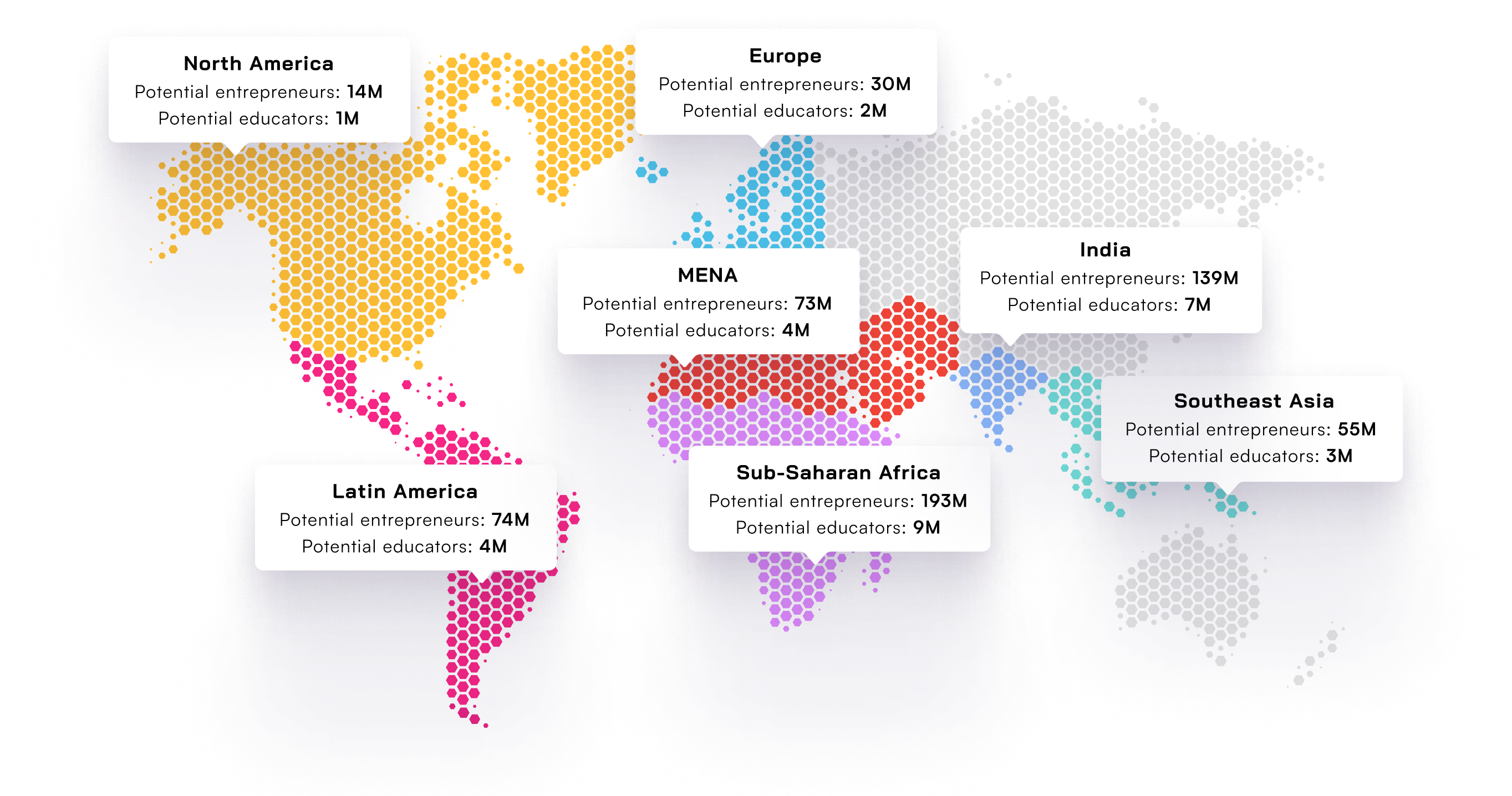


Problem: Entrepreneurship Education is Inadequate
Learning how to start and run your own business can help beat unemployment. Sadly, many schools ignore, or are unable, teaching this important skill, leaving many potential and budding entrepreneurs without the help they need. This problem hits harder in developing countries, where 90% of young people live. They struggle to get good education and training, making it tough to be financially stable and independent. As machines and computers take over more jobs, young people need entrepreneurial skills to stay competitive and have a fair chance of finding meaningful work. As everything is moving online, it's crucial to leverage technology to make entrepreneurship accessible.
Global youth unemployment rates are at alarming heights
Africa's booming youth population highlights the pressing need for substantial support and opportunities to ensure sustainable growth. South Africa is one extreme example, where two out of three of its youth, 64% as of 2023, are without any sort of employment. India faces similar challenges in catering to its vast youth demographic, with 375 million individuals aged 28 or younger among the nation's 1.4 billion population. A major obstacle is the continuous increase in youth unemployment, 28.26% as of 2022, continuing on a decade-long upward trend. Across the globe, the gravity of youth unemployment is not as extreme, yet still alarming - a staggering 16% of youths aged 15-24 grapple with unemployment. In Latin American countries the youth unemployment rate sits around 20.5% as of 2022. These numbers are further echoed in the MENA region, where an overwhelming 87% of youths express deep concerns about unemployment. Despite these challenges, there is a resilient spirit within the global youth population. By acknowledging the urgency of the situation and implementing comprehensive, tailored solutions, we can foster a future where the immense potential of young minds transforms obstacles into opportunities, creating a more promising and sustainable world for all.
64%
Youth unemployment in South Africa
16%
Youth unemployment across the globe
87%
Youths in MENA have unemployment concerns
Our Change Theory: Making Entrepreneurship Accessible
Edventures was founded on the hypothesis that entrepreneurship possesses a unique potency—an ability to enable individuals to realise their ideas and dreams. More than a mere economic pursuit, we perceive entrepreneurship as a fundamental right, a realm accessible to all who dare to embark upon it. However, this hypothesis didn't arise in a vacuum. It was nurtured by the undeniable surge in unemployment among youths and young adults, an alarming trend that has persisted for the past decades and appears to have reached unprecedented levels.
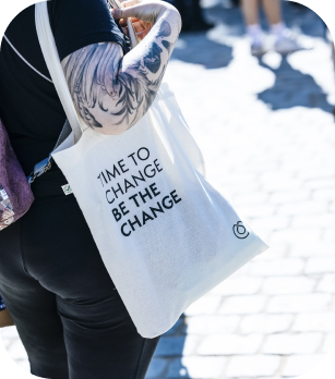

Empowering the entrepreneurs of tomorrow
To realise this vision, a digital solution emerges as a necessity, an enabler of scalable support. It is here that existing entrepreneurship supporting organisations and ecosystems fail significantly, leaving a vast majority of potential entrepreneurs yearning for the backing they need and deserve. This strong belief drives our confidence in Edventures as a clear solution. We call for a future where every aspiring entrepreneur, especially the youth, can easily access essential guidance and support for their entrepreneurial journey. With this support lies the potential to ignite a surge of prosperous ventures, reshaping both the entrepreneurial scene and fostering economic growth.
Our Sustainable Development Goals
As a way to define and explain our backbone and reason to exist, as well as to how we make an impact in the world, we use the United Nations Sustainable Development Goals (UNSDGs) as a guiding framework on how to define, measure and follow-up on our impact. In 2015, the UN settled on 17 sustainability development goals, broken down into targets, to tackle some of our biggest social, economic and environmental challenges. At Edventures, we’re deeply committed to social impact and we strive to meet these two targets within Goals 4 and 8.
4.4 “Substantially increase the number of youth and adults who have relevant skills, including technical and vocational skills, for employment, decent jobs and entrepreneurship”
Anna's Personalised Support: Anna, our conversational AI, plays a crucial role in addressing SDG 4.4. By engaging with Anna, users receive personalised feedback, coaching, and support tailored to their unique entrepreneurial journey. This not only enhances their entrepreneurial skills but also equips them with the relevant skills needed for entrepreneurship and self-employment.
Eddie's Gamified Learning: Eddie transforms the learning process into an engaging game, offering interactive quizzes and challenges. This gamified approach ensures that users not only acquire knowledge but also develop practical, applicable skills. This aligns directly with SDG 4.4 by increasing the number of individuals with relevant technical and vocational skills, making them better prepared for the job market as entrepreneurs.
Franklin's Toolkit for Coaches: Franklin provides personalised insights and metrics for coaches to guide entrepreneurs effectively. By empowering coaches with tailored tools, we contribute to the goal of increasing the number of youth and adults with the necessary skills for entrepreneurship. This creates a ripple effect as coaches play a pivotal role in shaping the skills and capabilities of the next generation of entrepreneurs.
In essence, Edventures doesn't just aim to support entrepreneurship; we strategically address the broader goal of equipping youth and young adults with the skills vital for self-employment and successful entrepreneurship. Our features work cohesively towards fostering a generation equipped with the skills needed to thrive in various professional avenues.


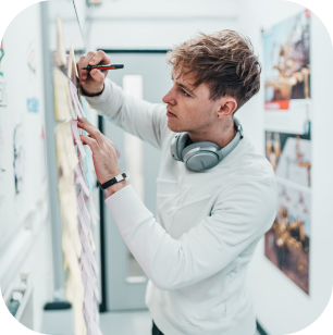
8.6 “Substantially reduce the proportion of youth not in employment, education or training (NEET)”
Anna's Personalised Guidance: Anna, our conversational AI, serves as a valuable resource for users navigating their entrepreneurial journey. By providing personalised feedback and support, Anna empowers individuals to pursue entrepreneurship as a viable option, potentially reducing the proportion of youths not in employment, education or training. Anna’s tailored guidance help youths build the skills and confidence necessary to engage in meaningful and successful self-employment.
Eddie's Gamified Learning: Eddie's gamified approach to learning entrepreneurship transforms education into an engaging experience. This not only attracts more youth but also makes the learning process enjoyable and effective. By fostering a positive attitude towards entrepreneurship education and developing entrepreneurial skills, Eddie's feature indirectly contributes to reducing the proportion of youth not in education or training.
Franklin's Toolkit for Coaches: Franklin equips coaches with personalised tools to guide entrepreneurs effectively. As coaches play a pivotal role in shaping the entrepreneurial journey of individuals, Franklin's toolkit ensures that more youth receive targeted support. This, in turn, can lead to a reduction in the proportion of youth not in employment, education, or training by creating pathways to meaningful and purposeful entrepreneurial endeavours.
Through our holistic approach, we actively address the challenges outlined in SDG 8.6. By promoting entrepreneurship as a viable and empowering option, we contribute to decreasing the number of youth not engaged in employment, education, or training, fostering a more inclusive and dynamic future for the younger generation.

Join our Earlybird Community!
Join us in shaping the future of entrepreneurship learning and guidance! As a member of our Earlybird Community, you'll be the first to try out our app, providing direct input for its enhancement, while connecting with other passionate, budding entrepreneurs across the globe.
